
Dashboard Design Best Practices: Creating Action-Oriented Analytics Interfaces
Three months ago, I met Elena, a data analytics manager at a multinational retail corporation, who was struggling with a paradox that plagues many modern organizations. Despite having access to more marketing data than ever before, her executive team was making increasingly uninformed decisions. The culprit was their dashboard system—a sprawling collection of 47 different metrics displayed across multiple screens that took 20 minutes to review and left viewers more confused than enlightened. After implementing a complete dashboard redesign focused on simplicity, audience-specific customization, and action-oriented insights, Elena's team reduced decision-making time by 60% while improving strategic accuracy by 40%.
Elena's experience illustrates a critical challenge facing organizations worldwide as they navigate the tension between comprehensive data availability and actionable insight delivery. The most successful companies are discovering that effective dashboard design is not about displaying more information, but about presenting the right information in ways that drive immediate, informed action.
1. Simplicity as the Foundation of Effective Dashboard Design
Dashboard simplicity represents far more than aesthetic minimalism; it embodies strategic focus that eliminates cognitive overload and enables rapid decision-making. Research from the Human-Computer Interaction Institute demonstrates that users can effectively process a maximum of seven key performance indicators simultaneously before experiencing decision paralysis. This limitation necessitates ruthless prioritization in dashboard design that emphasizes critical business drivers over comprehensive data display.
The principle of progressive disclosure becomes essential in sophisticated dashboard architectures, allowing users to access detailed information through intuitive drill-down mechanisms while maintaining clean primary interfaces. This approach satisfies both executive needs for high-level insights and analytical requirements for granular investigation. Successful implementations provide multiple information layers accessible through contextual interaction rather than overwhelming primary displays.
Visual hierarchy plays a crucial role in dashboard simplicity by guiding user attention to the most critical information first. Strategic use of size, color, and position directs focus to key performance indicators while supporting metrics remain accessible but secondary. This hierarchy must align with business priorities and decision-making workflows to maximize effectiveness.
The elimination of redundant information and decorative elements allows users to focus entirely on decision-relevant insights. Every dashboard element should serve a specific analytical purpose or support immediate action. This disciplined approach requires continuous refinement and user feedback integration to maintain optimal simplicity without sacrificing necessary functionality.
2. Action-Oriented Design Philosophy
Action-oriented dashboard design transcends traditional reporting by embedding decision triggers and recommended responses directly into analytical displays. This approach transforms dashboards from passive information sources into active decision support systems that guide user behavior toward optimal outcomes. The design must anticipate user needs and provide contextual guidance for interpretation and response.
Threshold-based alerts and automated recommendations enhance dashboard effectiveness by highlighting when performance deviates from expected ranges and suggesting appropriate interventions. These systems must balance sensitivity with noise reduction to avoid alert fatigue while ensuring critical issues receive immediate attention. Machine learning algorithms can improve alert accuracy by learning from user responses and historical patterns.
Interactive elements enable users to explore scenarios and test hypotheses directly within dashboard interfaces rather than requiring separate analytical tools. What-if modeling capabilities, filter adjustments, and comparative analysis functions empower users to investigate performance drivers and evaluate potential strategies. This interactivity transforms passive consumption into active exploration and learning.
The integration of workflow management capabilities allows dashboards to facilitate not only decision-making but also implementation and follow-up activities. Users can assign tasks, set reminders, and track progress on initiatives directly from analytical displays. This integration creates seamless transitions from insight to action, improving execution rates and accountability.
3. Audience-Specific Customization Strategies
Effective dashboard design recognizes that different organizational roles require distinct information perspectives and analytical capabilities. Executive dashboards must emphasize strategic outcomes and trend identification, while operational dashboards focus on tactical performance and process optimization. Marketing dashboards require campaign-specific metrics and creative performance insights that differ significantly from sales dashboard requirements.
Role-based customization extends beyond metric selection to include visualization preferences, update frequencies, and interaction patterns. Senior executives typically prefer high-level trend visualization with exception reporting, while analysts need granular data exploration capabilities and statistical analysis tools. The same underlying data must be presented through interfaces optimized for each user type's decision-making needs.
Personalization capabilities allow individual users to configure dashboards according to their specific responsibilities and preferences while maintaining organizational standards and governance requirements. This customization includes metric prioritization, layout preferences, alert thresholds, and integration with personal productivity tools. Advanced systems learn from user behavior patterns to suggest optimizations and improvements.
Cross-functional dashboard design addresses the needs of collaborative decision-making by providing shared views that facilitate communication and alignment across organizational boundaries. These interfaces must balance individual role requirements with collective understanding needs, often through layered information architecture that supports both specialized and generalized perspectives.
4. Strategic Use of Colors, Trends, and Context
Color psychology and data visualization best practices combine to create dashboard interfaces that communicate information effectively while minimizing misinterpretation. Strategic color application goes beyond aesthetic appeal to encode meaning, highlight importance, and guide user attention. Red typically indicates problems or alerts, green suggests positive performance, and neutral colors provide context without distraction. Consistency in color application across organizational dashboards prevents confusion and accelerates comprehension.
Trend visualization requires sophisticated understanding of temporal patterns and statistical significance to avoid misleading interpretations. Moving averages, seasonal adjustments, and confidence intervals provide context that prevents overreaction to normal variations while highlighting truly meaningful changes. The choice of time periods, baseline comparisons, and trend analysis methods significantly impacts decision quality.
Contextual information integration helps users interpret performance data within broader business environments including competitive dynamics, seasonal patterns, and external market conditions. This context prevents isolated metric optimization that might harm broader business performance while enabling more strategic decision-making. Economic indicators, industry benchmarks, and historical performance ranges provide essential reference points.
Predictive elements enhance dashboard value by providing forward-looking insights alongside historical performance data. Forecasting models, leading indicator tracking, and scenario analysis capabilities help users anticipate future challenges and opportunities. These predictive elements must include uncertainty quantification to prevent false confidence in projections.
5. Avoiding Metric Overload Through Strategic Selection
Metric overload represents one of the most common dashboard design failures, resulting from the temptation to display all available data rather than focusing on actionable insights. Research from MIT's Sloan School of Management indicates that each additional metric beyond the optimal number reduces decision accuracy by approximately 12% while increasing decision time by 8%. This degradation occurs because users struggle to identify priorities among competing information sources.
The development of metric hierarchies helps organizations distinguish between primary performance indicators that drive immediate decisions and secondary metrics that provide supporting context. Primary metrics should directly correlate with business objectives and trigger specific actions when thresholds are breached. Secondary metrics offer analytical depth for investigation but should not compete for primary attention.
Metric selection must align with decision-making authority and influence scope for each dashboard audience. Users should only see metrics they can meaningfully impact through their actions and decisions. This alignment prevents frustration and misdirected efforts while maintaining focus on controllable performance drivers. Cross-functional metrics require careful presentation to avoid diffused responsibility.
Dynamic metric prioritization based on business cycles, strategic initiatives, and performance anomalies keeps dashboards relevant and actionable. The most important metrics may change based on seasonal patterns, competitive threats, or organizational focus areas. Automated systems can adjust metric prominence based on predefined rules and performance thresholds, ensuring continued relevance without manual intervention.
Case Study: Spotify's Dashboard Evolution for Marketing Teams
Spotify's marketing analytics team underwent a comprehensive dashboard redesign in 2022 to address declining user engagement with their analytical platforms. The original system featured over 60 metrics across multiple screens, requiring 30 minutes of review time and resulting in delayed campaign optimization decisions.
The redesign implemented a three-tier information architecture with primary metrics limited to five key performance indicators directly tied to campaign objectives. Secondary metrics were accessible through single-click drill-downs, while detailed analytics remained available through dedicated exploration interfaces. The team implemented role-specific customization allowing campaign managers, creative teams, and executive stakeholders to access tailored views of the same underlying data.
Color coding followed strict psychological principles with performance trending indicated through intuitive green-yellow-red schemes. Contextual information included industry benchmarks, seasonal expectations, and competitive intelligence to enable strategic interpretation. Action-oriented elements included automated recommendations for budget reallocation and creative optimization based on performance patterns.
Results demonstrated dramatic improvements in user engagement and decision quality. Dashboard usage increased by 180% while average session time decreased from 30 to 12 minutes. Campaign optimization decisions occurred 40% faster, and A/B testing revealed 25% improvement in campaign performance following dashboard-driven optimizations. User satisfaction scores increased from 3.2 to 4.6 out of 5.0, with particular praise for the simplified interface and actionable insights.
The Spotify case illustrates how strategic dashboard design can transform analytical capabilities from information overload into competitive advantage through focused, action-oriented presentation of critical business intelligence.
Conclusion
Dashboard design excellence emerges from the disciplined application of simplicity, action orientation, and audience-specific customization principles. Organizations that master these fundamentals create analytical interfaces that accelerate decision-making while improving strategic accuracy. The most effective dashboards serve as decision support systems rather than mere reporting tools, guiding users toward optimal actions through intelligent information presentation.
The digital era has expanded dashboard possibilities while simultaneously increasing the importance of design discipline. Advanced visualization capabilities, real-time data integration, and AI-powered insights must be channeled through focused design principles that prioritize user needs over technical capabilities. The organizations that resist feature bloat while embracing strategic simplicity will achieve sustainable analytical advantages.
Future dashboard evolution will likely emphasize predictive capabilities, natural language interfaces, and automated insight generation while maintaining the fundamental design principles of simplicity and action orientation. Success will continue to depend on deep understanding of user needs, decision-making processes, and organizational contexts rather than purely technological sophistication.
Call to Action
Organizations seeking to optimize their dashboard effectiveness should begin with comprehensive user research that identifies specific decision-making needs, information preferences, and workflow integration requirements. Conduct dashboard audits that evaluate current metric selection, visual design, and usage patterns to identify optimization opportunities.
Implement pilot programs that test simplified, action-oriented dashboard designs with specific user groups before broad deployment. Use A/B testing methodologies to validate design decisions and measure impact on decision quality and speed. Collect continuous user feedback to guide iterative improvements and maintain alignment with evolving needs.
Invest in design thinking capabilities and user experience expertise that can translate complex analytical requirements into intuitive, actionable interfaces. Establish governance processes that prevent metric proliferation while ensuring continued relevance and strategic alignment. Most importantly, maintain focus on business outcomes rather than technical capabilities when making dashboard design decisions.
Featured Blogs
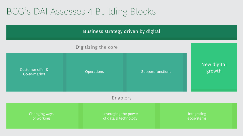
BCG Digital Acceleration Index
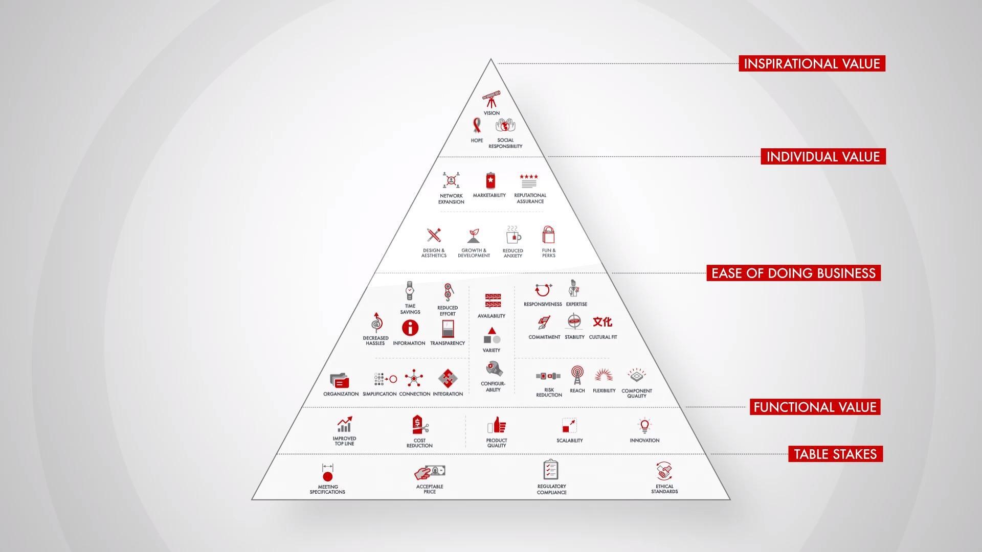
Bain’s Elements of Value Framework
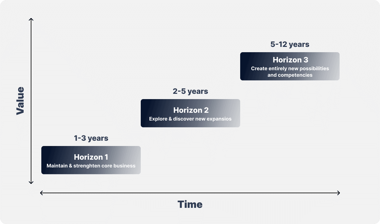
McKinsey Growth Pyramid
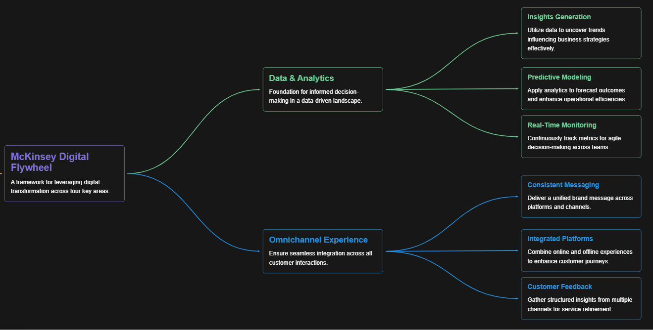
McKinsey Digital Flywheel
McKinsey 9-Box Talent Matrix
McKinsey 7S Framework
The Psychology of Persuasion in Marketing
The Influence of Colors on Branding and Marketing Psychology